

When designing or updating a website there are many factors to consider. You need to select images, choose fonts, figure out how the best navigation layout works, and much, much more. However during these many decisions that need to be made, it is important to put some focus on how accessible your website is to the public. One of the make-or-break accessibility features is how color accessible your site is.
What is color accessibility?
Color is a key factor in any design, but with something as important as a website, you want to ensure it’s used properly. Not only do you want the colors on your website to look good, they should also have good functionality. Color accessibility is making sure your use of color is not hindering the accessibility, readability, or functionality of your website for people with a variety of abilities.
Why is color accessibility important?
Color accessibility is important for everyone, not just people with seeing impairments. Having effective color accessibility can be helpful in as basic of a situation as someone looking at your site on their phone in the bright sunlight – it can be hard to see distinctive differences. It is also obviously important to increase accessibility for those with differing abilities to ensure proper inclusion.
In fact, considering this accessibility feature and additional ones can actually be required by law. If you are a government agency, federally funded non-profit, public higher education institution or a public K-12 school, you are required to meet the Title II of the Americans with Disabilities Act.
While other types of business websites may not have to legally follow this act, there is a set of guidelines that are recommended for websites to adhere to: Web Content Accessibility Guidelines (WCAG) 2.1.
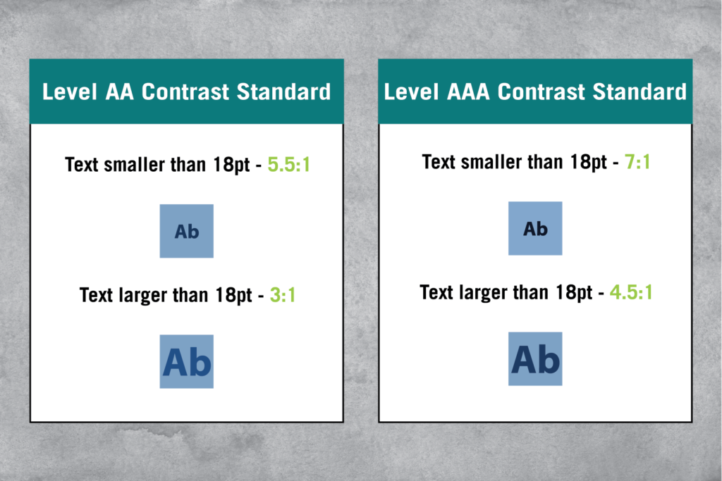
Understanding the basics of contrast
Color contrast is important in all types of design, without contrast it is difficult to notice any one thing from another. Typically in web design, contrast is used to highlight important information or signal an action or button. These are all important functions that you want your visitors to pay attention to!
The WCAG ranks success for text-to-background contrast with different levels. AA represents the minimum accessibility compliance, where AAA represents the highest standard.
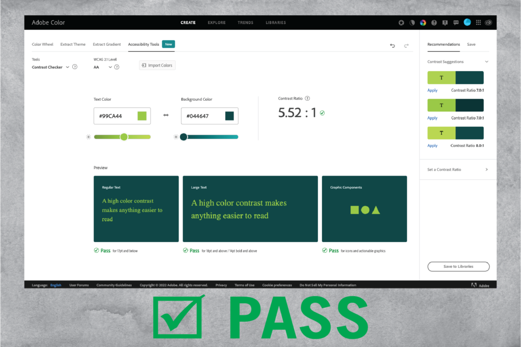
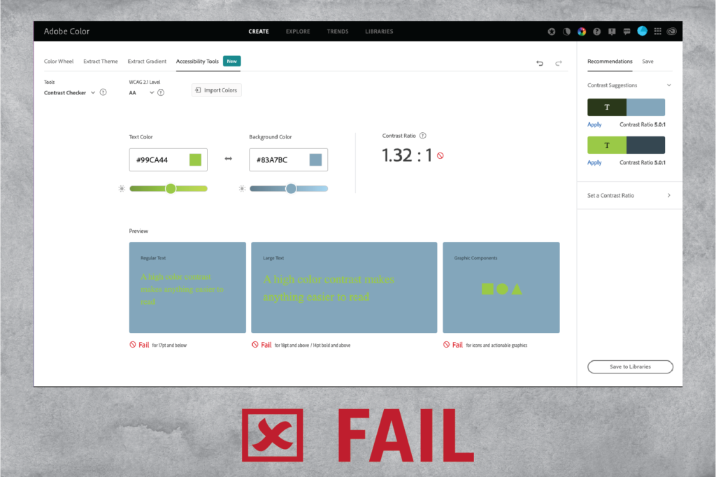
Checking your contrast ratio
There are tools to help you test out your color ratios and see how accessible they are for a website or other design projects. Go to Adobe Color Contrast Checker and enter the HEX Code for the colors you want to compare. Here you can see if your color combinations pass or fail. In addition, you can adjust the sliders to see how much darker or lighter colors need to be in order to pass.
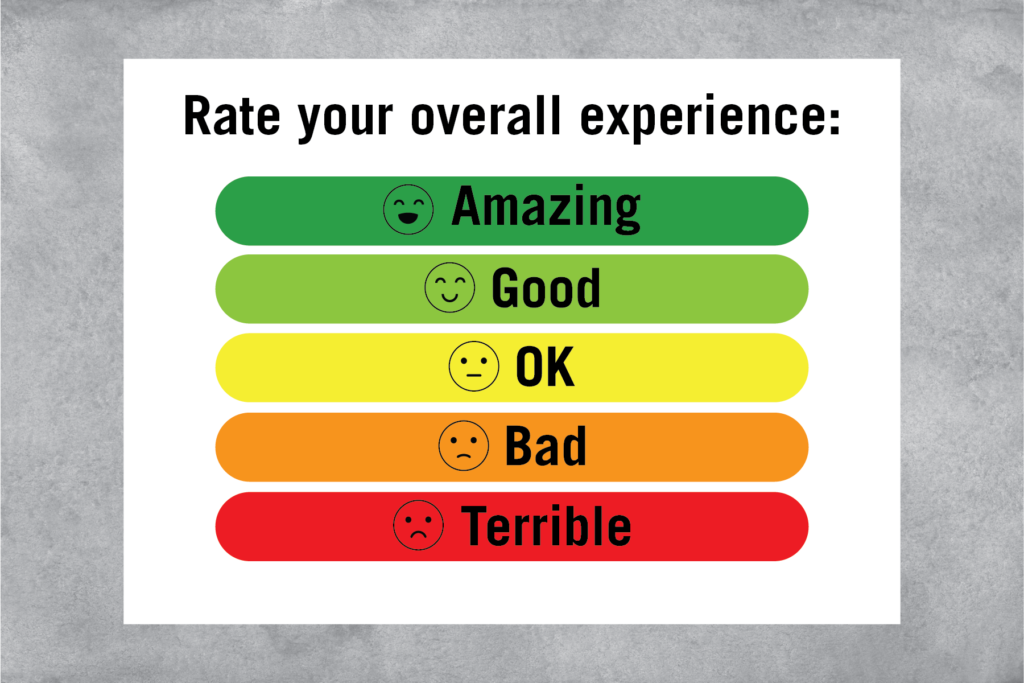
supplement color with design and function
A website can become less accessible if color is used alone as an indicator. Web designers should incorporate color with other elements such as forms, buttons, titles, etc.
A great and common example of this is when a required field in a form is not filled out, a red notification pops up stating the form is incomplete. In addition, utilizing symbols/icons in addition to colors for things like headers, forms with multiple options, etc can be a great option for distinguishing options (see below image).
in conclusion
Creating a color conscious website does not only create a more accessible website for all users but also allows for easy navigation, a clean look, and can even lead to better SEO. See how your website may change with these helpful tips.