When it comes to picking the right font, sometimes it can be a little overwhelming. With hundreds of options to pick from and near endless variations. Picking the right font can be a little intimidating. Understanding font categories can help you pick the right font every time!
serif

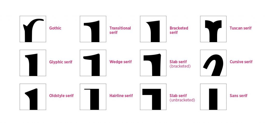
Serif fonts are those that have a serif present on the letters within the typeface. “A serif is a decorative line or taper added to the beginning and/or end of a letter’s stem, which creates small horizontal and vertical planes within a word.” Serifs are often called feet that are present at the top and bottom of letters.
Serifs are used for a variety of different designs. They are often used in large bodies of text, such as books and magazines because the serifs make for very easy reading. When designing in large bodies of text, designers often pair serifs with a san-serif font to create a balanced look. Additionally, serifs are also used for logos that want to portray a sense of quality and class.
Some notable Serif fonts include Times New Roman, Garamond, Baskerville, Georgia, and Courier New!
sans-serif

Sans-Serif fonts are the “opposite” of serif fonts. They lack the decorative line or taper on the end of the letters. Instead they are seemingly more simple and are considered to be a more modern typeface.
Sans-Serif fonts are often used to emulate the feeling of being casual, informal, friendly, and very approachable. They are often used for more basic designs when something needs more readability, however that is not a limiting factor. Sans-serif typefaces are use by many brands such as The North Face and Facebook to showcase their brand identity.
Some notable Sans-Serif fonts include Arial, Helvetica, Proxima Nova, Futura, and Calibri!
slab serif

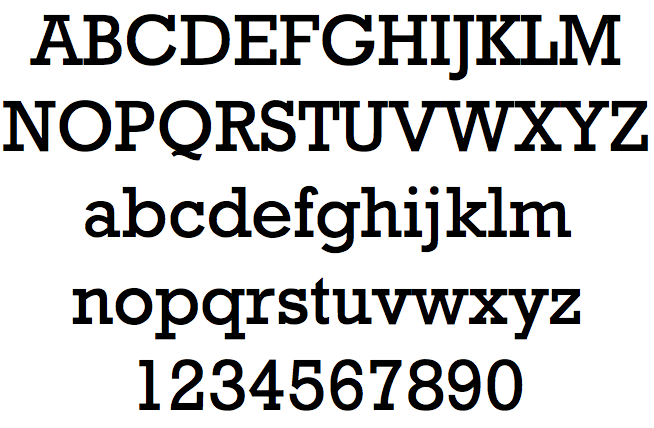
Sans-Serif fonts are the “opposite” of serif fonts. They lack the decorative line or taper on the end of the letters. Instead they are seemingly more simple and are considered to be a more modern typeface.
Sans-Serif fonts are often used to emulate the feeling of being casual, informal, friendly, and very approachable. They are often used for more basic designs when something needs more readability, however that is not a limiting factor. Sans-serif typefaces are use by many brands such as The North Face and Facebook to showcase their brand identity.
Some notable Sans-Serif fonts include Arial, Helvetica, Proxima Nova, Futura, and Calibri!
script

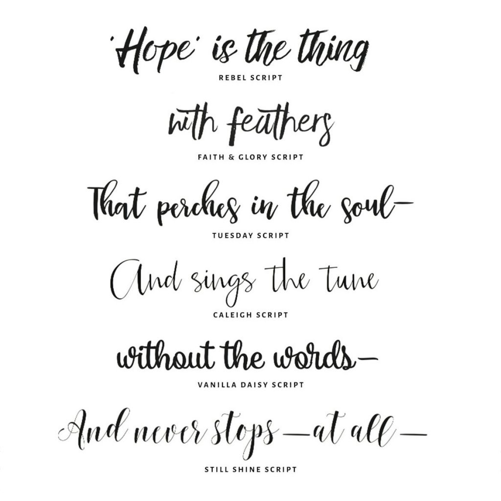
A Script font is one that mimics cursive handwriting. Often script fonts are those that resemble handwritten calligraphy. Font scripts should be used sparingly as they can affect readability in large amounts of text and and make words marks difficult to read.
Scripts add a sense of elegance and sophistication to a design. While these are not meant for long bodies of text, they can add flair to a design. Script fonts often make a design feel expensive or glamourous. Just know that less is more when it comes to scripts, and make sure to keep only one script in each design.
decorative

In the end, choosing the right font can be made easier by first choosing a style. Once a style is selected, the variation between fonts is heavily minimized. Choosing fonts is sometimes anything but simple. Understanding different styles will help make picking fonts easier in the future!
