Color has a huge impact on how we live our lives. No matter if it’s the color of paint we choose for a room, the color of a shirt we decide to wear for an interview, or the color frosting we put on a cake, it all has an impact. So when it comes to something as important as a logo, website, promotional or marketing items, it is extremely important to consider your color choices and what you aim to achieve from them.
In general, there are specific emotions associated with each color. Of course, emotions, and color are subjective to each person, but in a general capacity, many people have similar associations for each color.
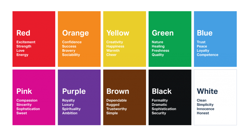
-
- Red: aggressiveness, passion, strength, love
- Pink: innocence, femininity, health, softness
- Orange: warm, exuberance, cheeriness, fun
- Green: health, freshness, tranquility, nature
- Blue: trust, peace, security, authority
- Purple: royalty, sophistication, luxury, ambition
- Brown: rugged, simple, earthiness, utility
- Black: boldness, distinctiveness, formality, dramatic
- White: clean, simplicity, honesty, purity
While each color has specific emotions that can be tied to it, it is also important to know that color preferences tie in with gender as well. As shown below, blue is a commonly liked color for both men and women. Women tend to prefer softer colors while men like bolder, brighter colors.
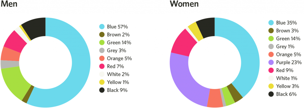
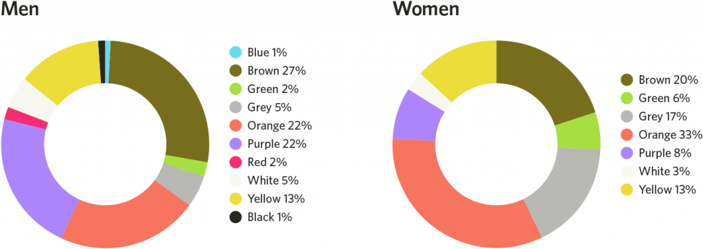
While it may seem based off of these color wheels that blue is the best color to use for design, while orange and brown should never be used, that is not the case. Each color has its place and purpose, and when used correctly even the most commonly “disliked” colors can create the most positive impacts.
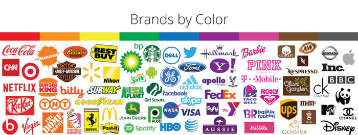
When choosing a color for your design product, the main thing to consider is your target audience. You may be inclined to choose colors that represent the people behind the business, but think about what can appeal to people you want to be communicating with. For example, if you’re designing a postcard for a medical practice, it might be instinctual to use blues to represent the cleanliness and professionalism of your doctors. But, when thinking about what your customers want, you might want to use warmer colors like oranges and yellows to show that your practice is a welcoming and comforting place to be.
