Logos, they are the single symbol, image, or text that represents your entire brand. Because your logo has such an immense impact, it is important that a lot of thought, creativity, and intention goes into the creation of it. Check out some of the current trends in logo design below!
1. simplification
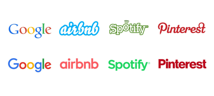
Over the years brands have realized that, in general, simple is better. A logo that is interesting to the eye yet isn’t too overwhelming is easy to recognize and remember. With all of the brands, images, and ads people see in a day, something simple in the chaos can actually stand out! Check out these companies that chose to simplify their logos.
2. soft colors
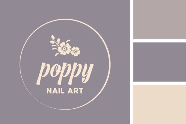
Historically, logos have often been bright and flashy with in-your-face colors. While this color palette does its job at catching people’s eyes, there is such an overwhelming amount of brands that use these types of colors to where the use of softer colors are becoming more noticable. Soft color palettes are the new way of standing out.

3. creative typography
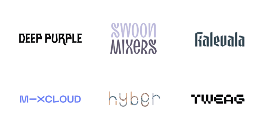
In line with the simplicity trend, more brands are deciding to use text-based logos with a creative twist. Using unique designs within text can show off the company’s personality and often is entertaining to look at.
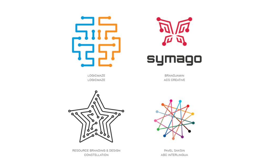
4. connect the dots
This new trend stems from another that has been being used more and more over the past few years, simple geometric shapes. This “connect the dots” trend is a fun spin on the simplicity of circles and lines but also can symbolize connectivity.
5. Negative space
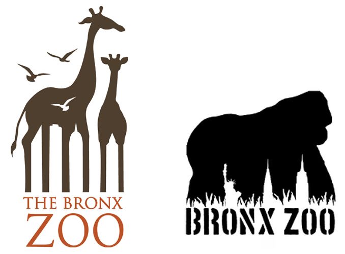
Negative space has been an upcoming trend for a while but has been booming recently. These types of logos often are able to represent multiple meanings or images all wrapped up in one logo. People like negative space logos because it’s almost like a riddle, the first time you look at it, you might just see some text, but the next time you see a hidden image, it’s very intriguing!
6. symmetry
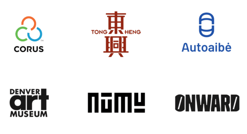
Symmetry is a logo trend that is here for the long run. It is naturally pleasing to the eye looking at something perfectly symmetrical. Symmetry also is inherently clean and elegant.
Now that you’ve taken a look at some of the new and upcoming trends for 2021, you might have a few ideas on what you’d like your new or updated logo to look like. If you think you might need some more advice, don’t hesitate to ask our design experts here at Poor Richard’s Press!
